For the final project of my Graphic Design Foundations course at the Danish Institute for Study Abroad (DIS), I created a remade a brand visual identity for Copenhagen based lifestyle and furniture brand FRAMA.
FRAMA is a multidisciplinary design and lifestyle brand based in Copenhagen that has gained international recognition for their products and approach to design. Founded in 2008 by Niels Strøyer Christophersen, the company produces everything from furniture, lighting, books, apparel, kitchenware, and body care products. The FRAMA brand aims to create straightforward designs that utilize natural materials and simple geometries. Their products encourage mindful living that engage the senses.
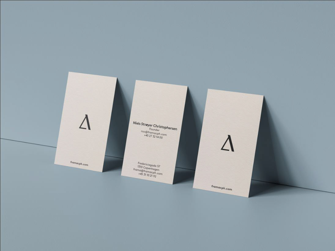
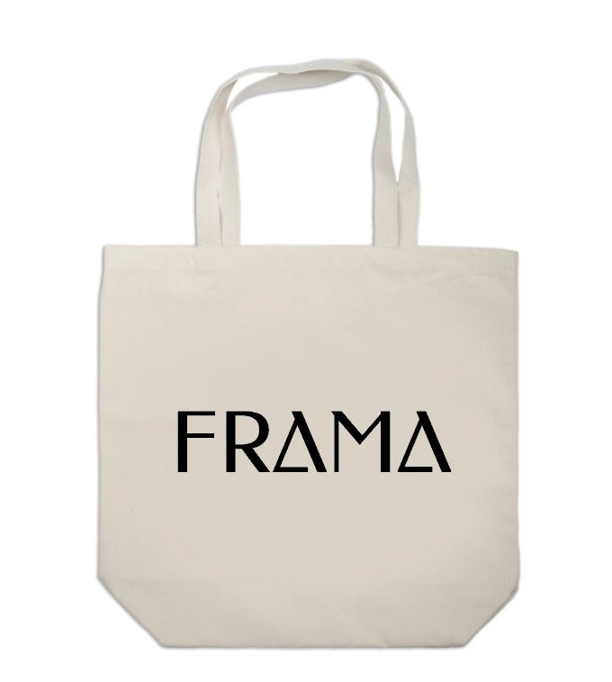
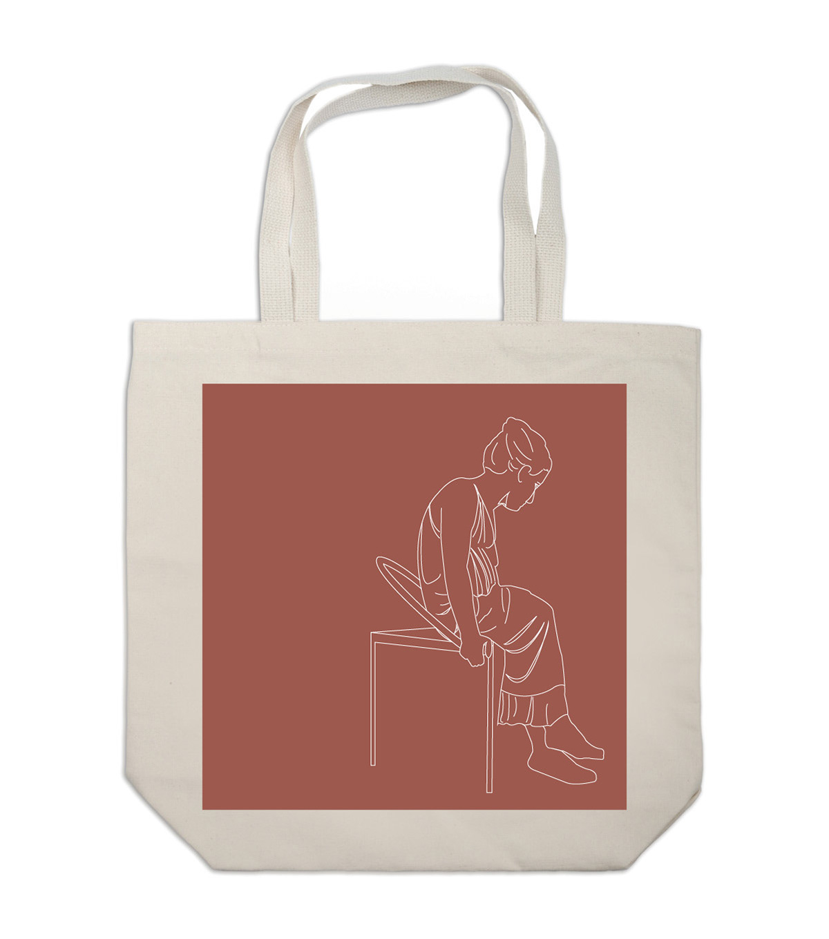
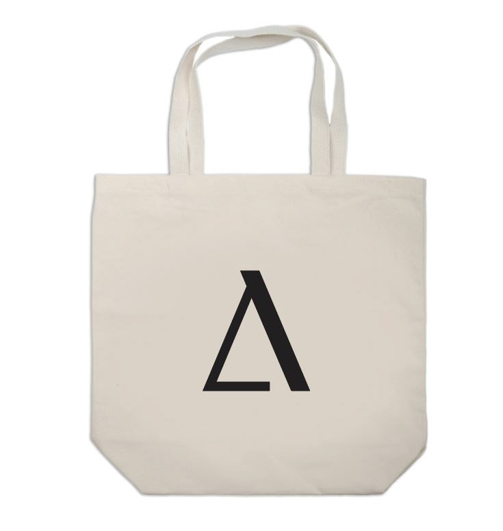
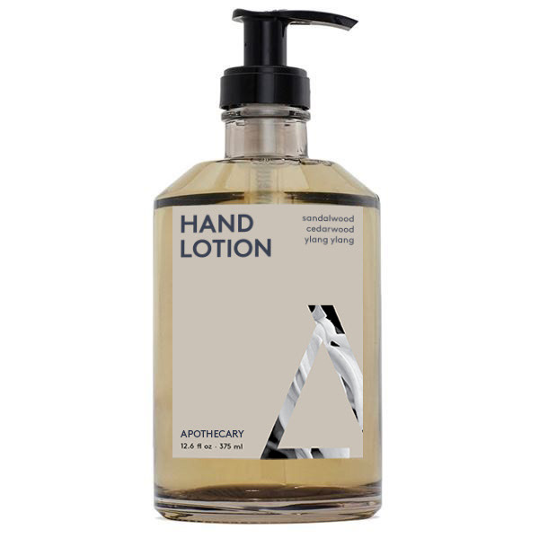
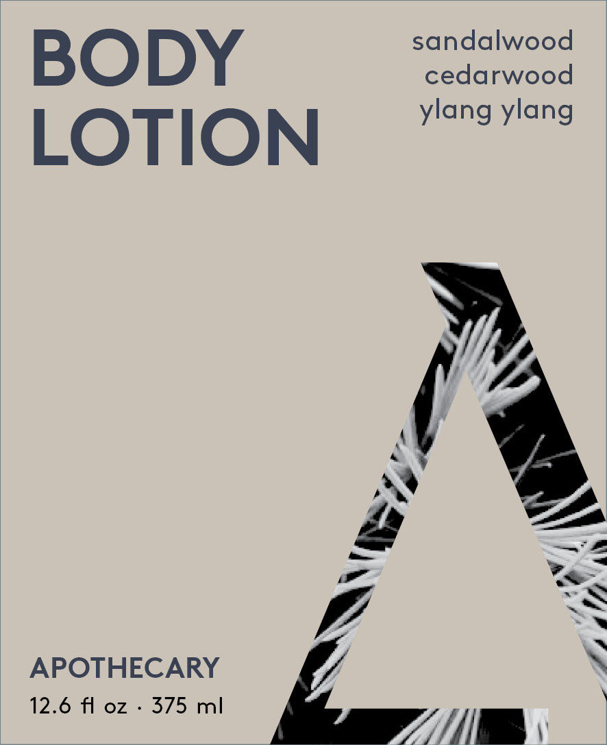
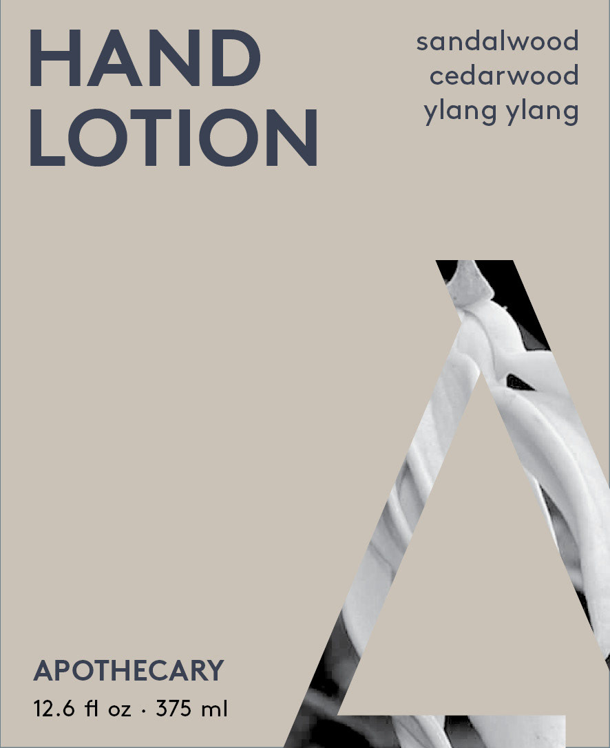
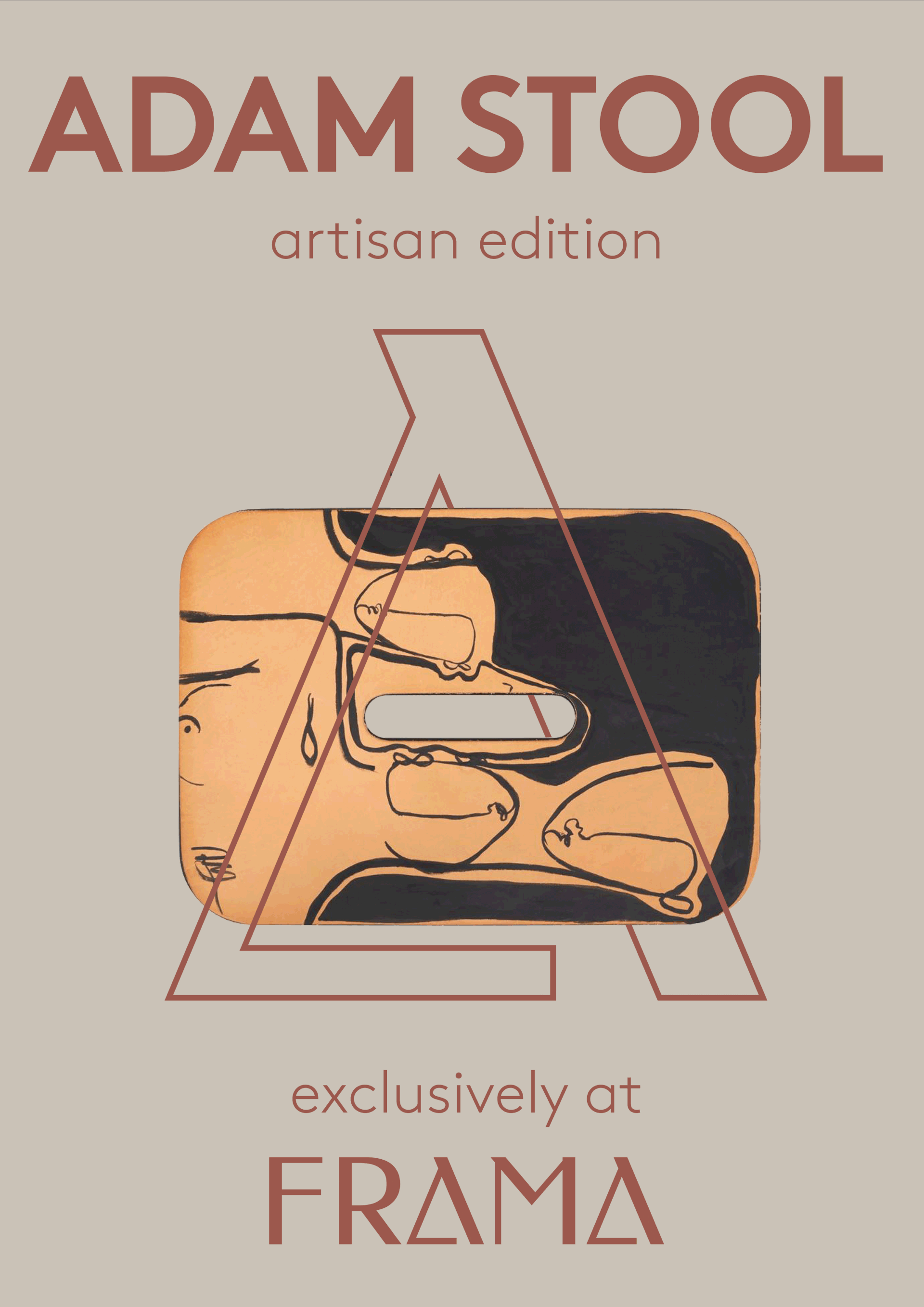
The brief called for the creation of a new logo, business card, a poster advertising a FRAMA product, tote bags, and labels for FRAMA’s body care line, Apothecary.
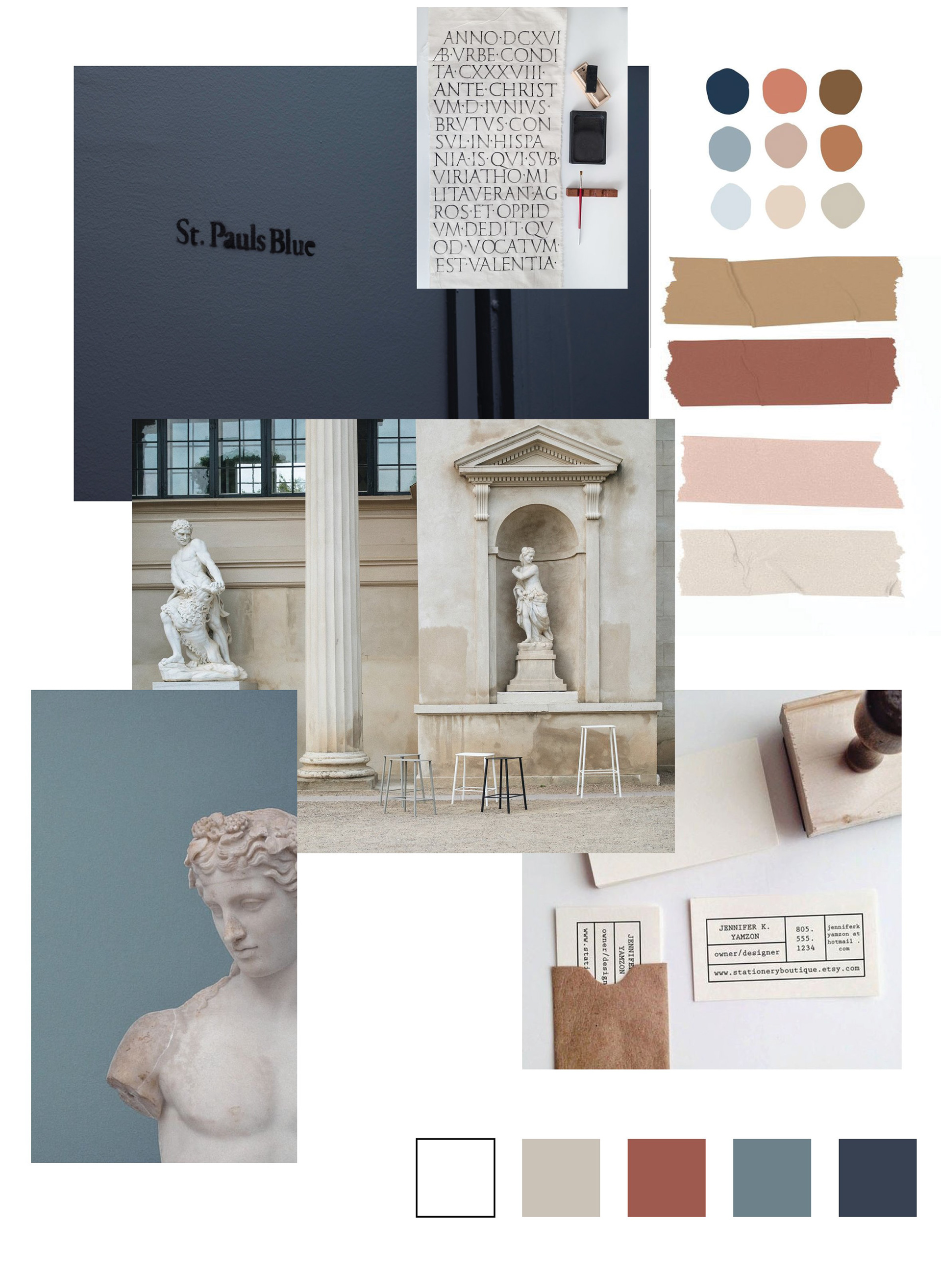
Moodboard
When I began to conceptualize what I wanted my version of the brand to look and feel like, what struck me about FRAMA was its dedication to blending both classical and modern elements into their work. I decided to lean into their use of classical elements and took inspiration from Greek and Roman architecture and iconography.
This direction influenced the color palette with each color referencing classical building materials, nature, and the patina process. The moodboard allowed me early on in the process to decide on a “neo-classical” and natural imagery based approach to photo curation for the project.

Final Logo

The "A" Letterform as a GIF
I wanted the logo to embody the concept words I had developed at the beginning of the project: permanent, essential, transparent, and classic. I opted for a type based logo, as I felt that would offer the most flexibility. I chose and edited the Federo font, a sans serif that I felt retained a classic and serif look with its dynamic use of thin and heavy line weights.
I knew from the beginning that I wanted to simplify the “A” in FRAMA into a triangle to both pay homage to the simple geometric forms throughout FRAMA’s work and reference FRAMA’s well known Triangolo chair. I left a small space between the bottom and left line to reference the incomplete nature of FRAMA’s work--the buyer of FRAMA’s works completes the product.
Finally, I felt it best that the “A” of the FRAMA logo could be used as an icon on its own. I created it as its own separate element that could work without the full FRAMA logo.
Finally, I felt it best that the “A” of the FRAMA logo could be used as an icon on its own. I created it as its own separate element that could work without the full FRAMA logo.
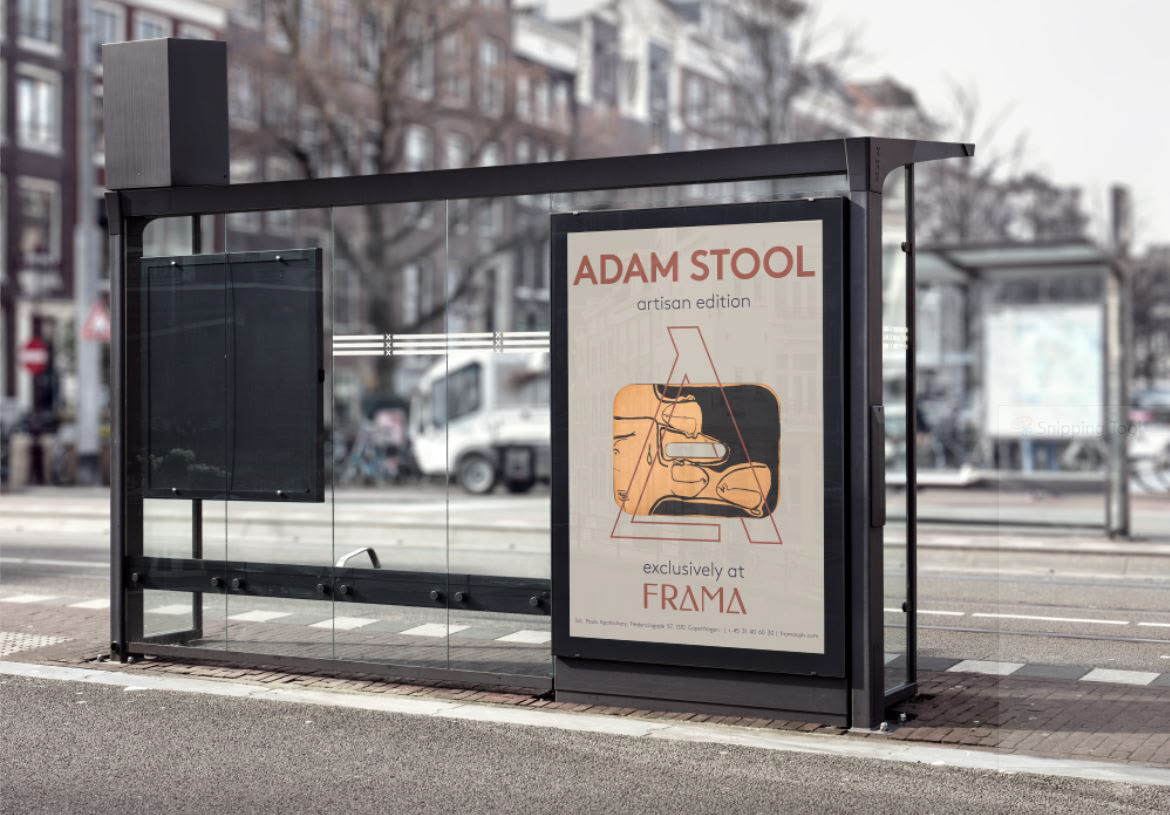
Upon completing the logo, colors, and visual elements, I moved on to applying the visual identity across advertisements, business materials, and products. I kept simplicity and emphasis on natural colors and materials at the forefront.