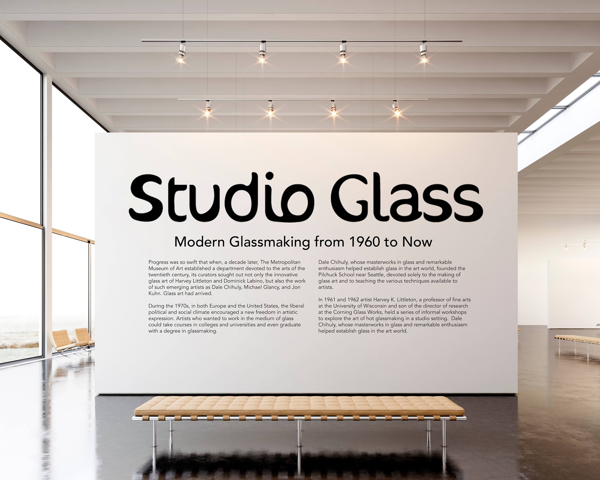
Studio Glass is a reimagining of the visual identity for a glass works exhibition of the same name staged at the Metropolitan Museum of Art in 1996. For the project, I created a unique exhibition logo, color palette, as well as posters, banners, and social media assets to advertise the show. The goal was to create a distinct visual identity that was reflective of the glassmaking process. Studio Glass is a non commissioned project.
Moodboard + Inspo
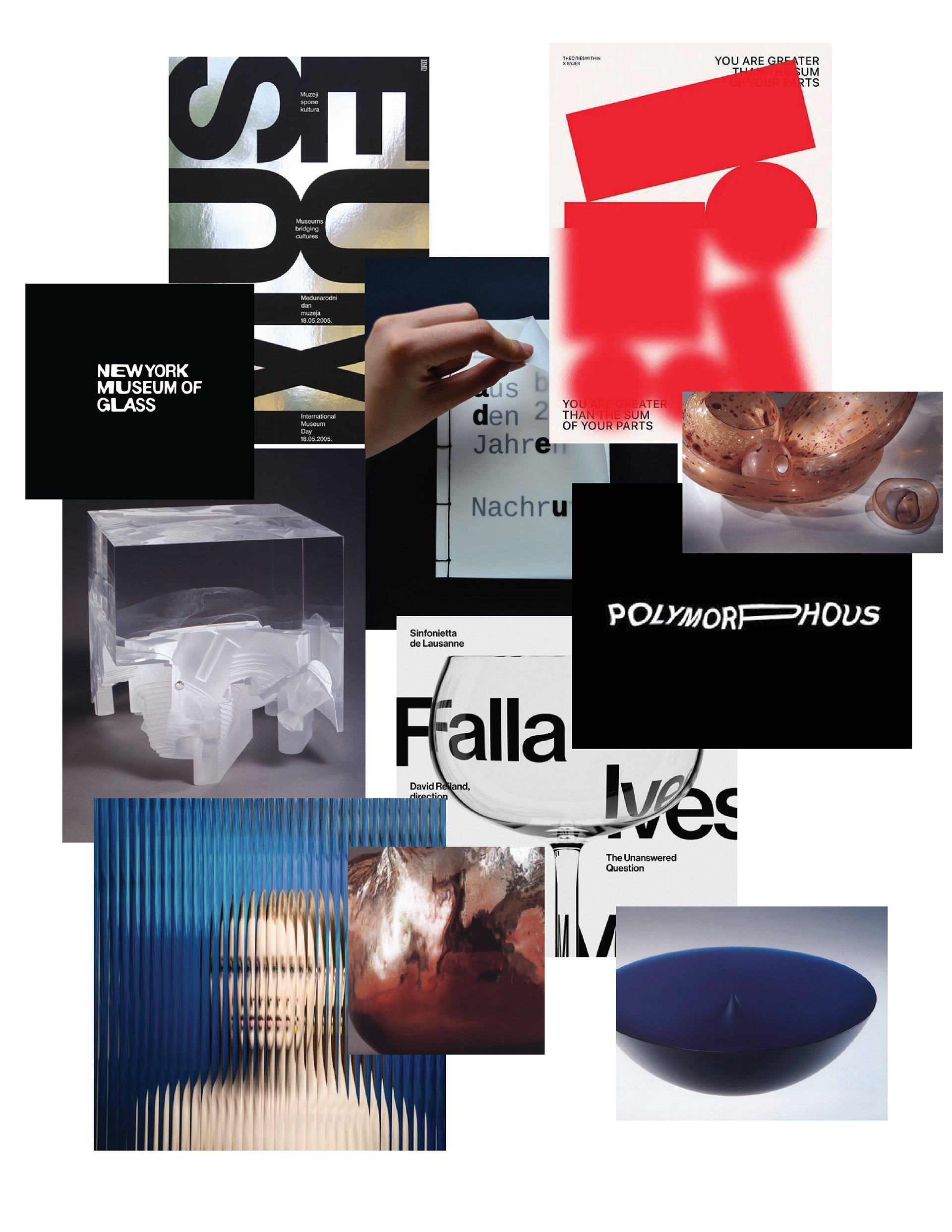
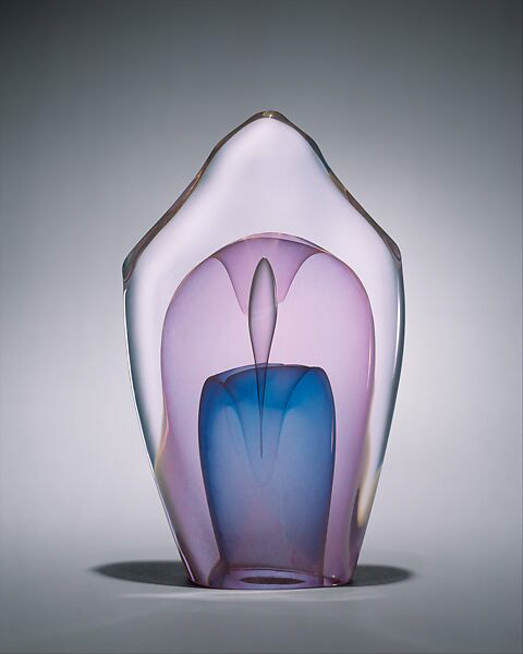
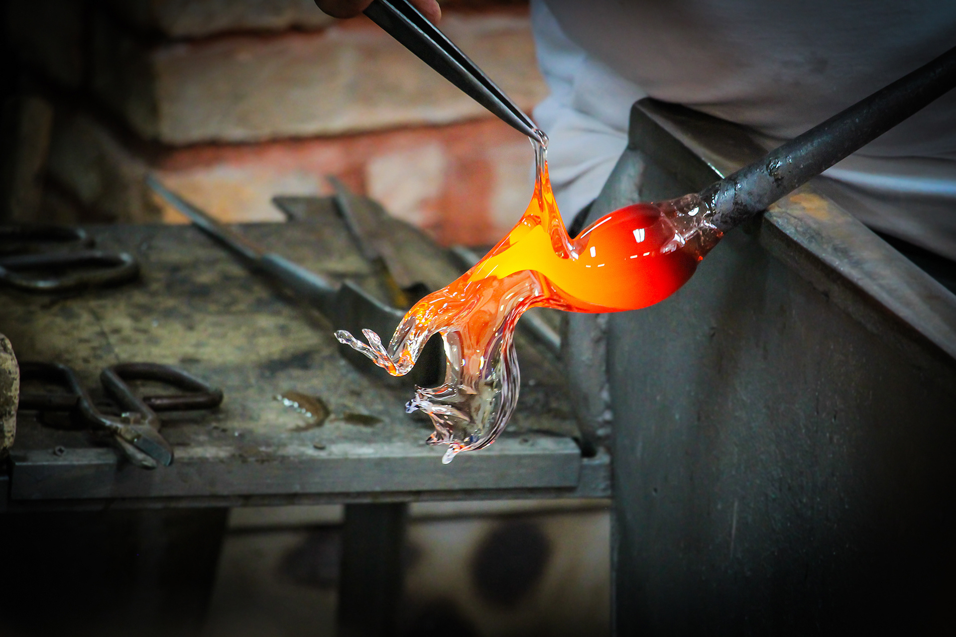
The Studio Glass exhibition catalog detailed the evolution of glassmaking from an industrial art in the 1800s to a personalized form of artistic expression in the mid 20th century. Inspired by the shift from the practice of glass blowing done primarily in a factory setting to a studio setting and the newly found personal expression in the craft, I focused on the process of glass art making to inspire the visual identity of Studio Glass. To that end, the initial moodboard I created emphasizes the materiality of glass and its reflective and distortive properties both in its completed form and its making.
The Studio Glass exhibition catalog detailed the evolution of glassmaking from an industrial art in the 1800s to a personalized form of artistic expression in the mid 20th century. Inspired by the shift from the practice of glass blowing done primarily in a factory setting to a studio setting and the newly found personal expression in the craft, I focused on the process of glass art making to inspire the visual identity of Studio Glass. To that end, the initial moodboard I created emphasizes the materiality of glass and its reflective and distortive properties both in its completed form and its making.
Color Palette
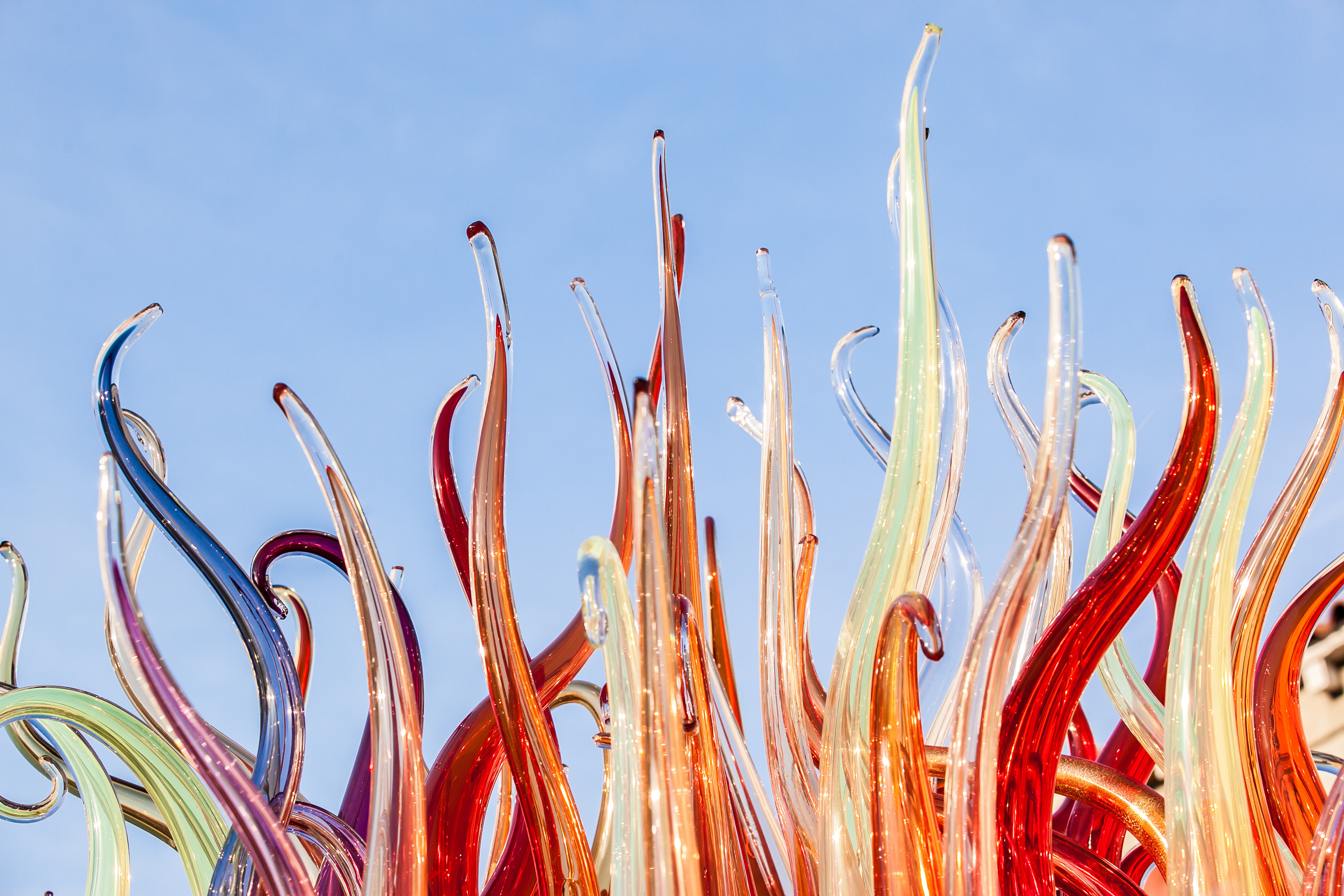
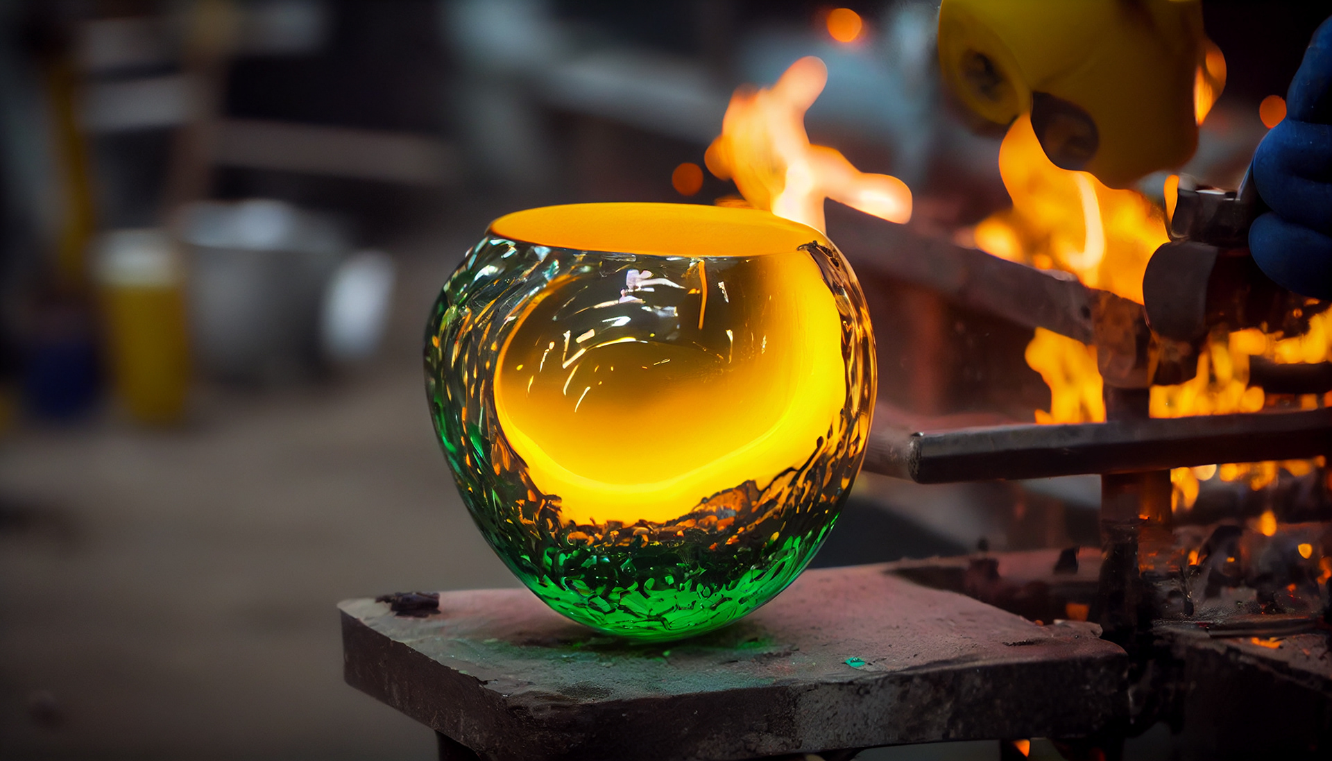
The colorful works of Dale Chihuly, one of the prominent glass artists that emerged out of the studio glass movement, influenced me to choose a bright color palette. I also wanted to capture the colors of the glowing heat of the furnace used in the studio.
The colorful works of Dale Chihuly, one of the prominent glass artists that emerged out of the studio glass movement, influenced me to choose a bright color palette. I also wanted to capture the colors of the glowing heat of the furnace used in the studio.
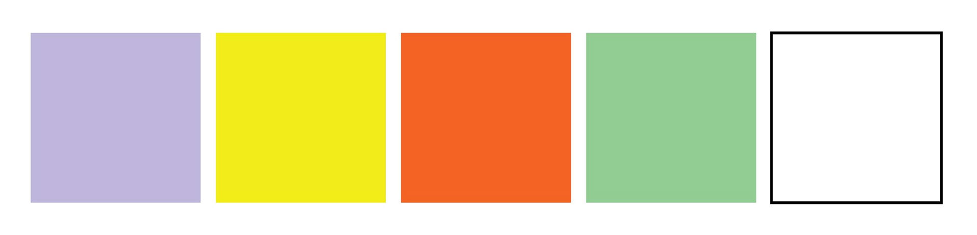
Final Color Palette
Type
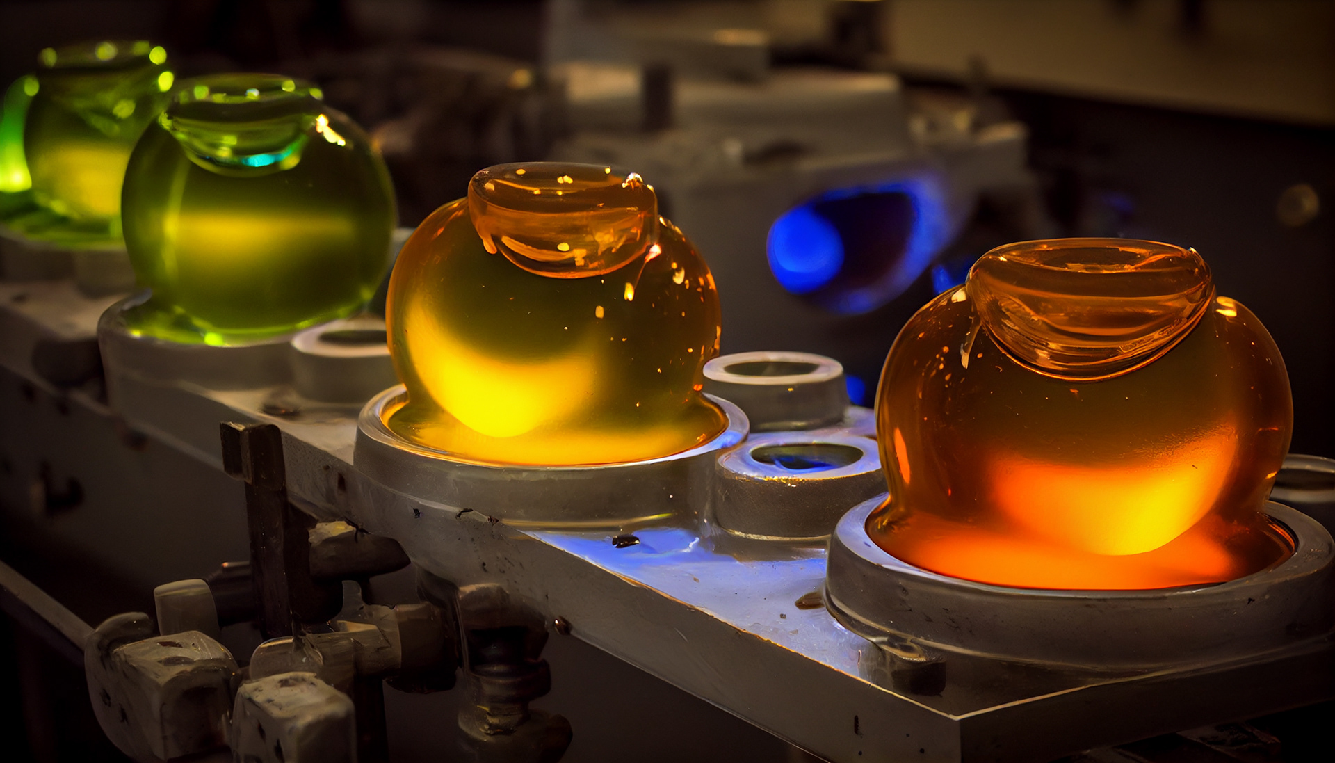
One of my favorite parts of researching for this project was diving into the process of making the glass in the studio— how it constantly had to be shaped to achieve its final form.
One of my favorite parts of researching for this project was diving into the process of making the glass in the studio— how it constantly had to be shaped to achieve its final form.

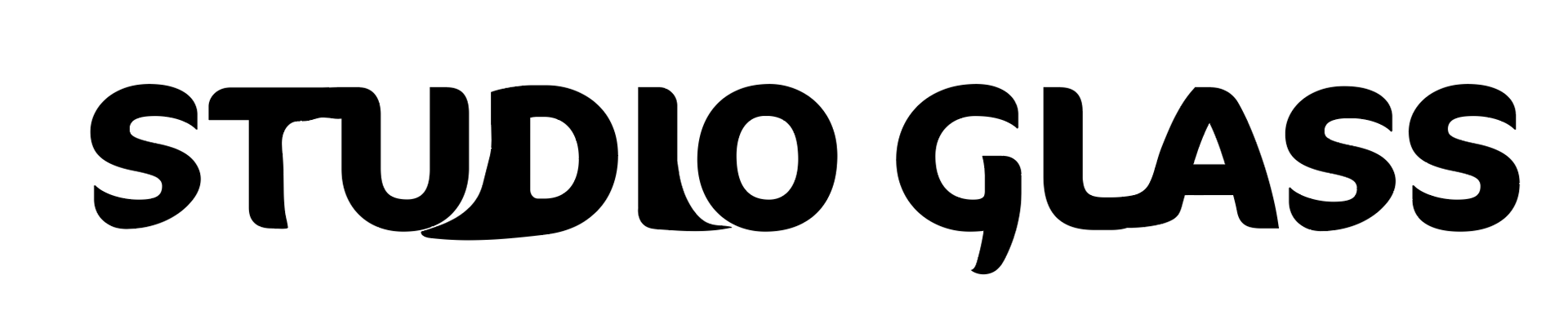
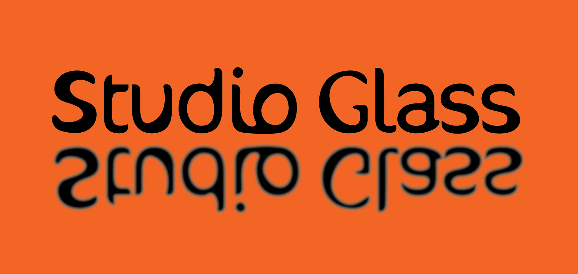
I wanted to channel the glassmaking process visually into the exhibition’s logo type, by experimenting with interconnecting the letters, undulating their forms, and manipulating the text to imitate flaring glass using the font Cocon Pro. I paired the logo with Avenir for the body text on posters and other exhibition materials.
Final Studio Glass Logotype
Posters + Print Ads
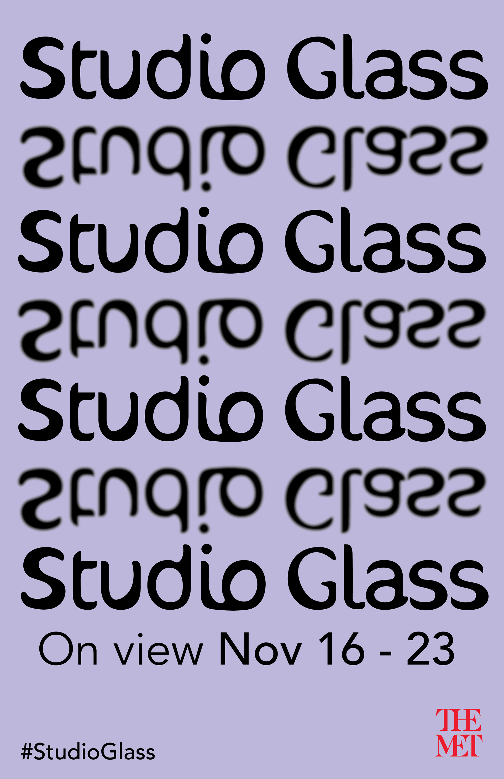
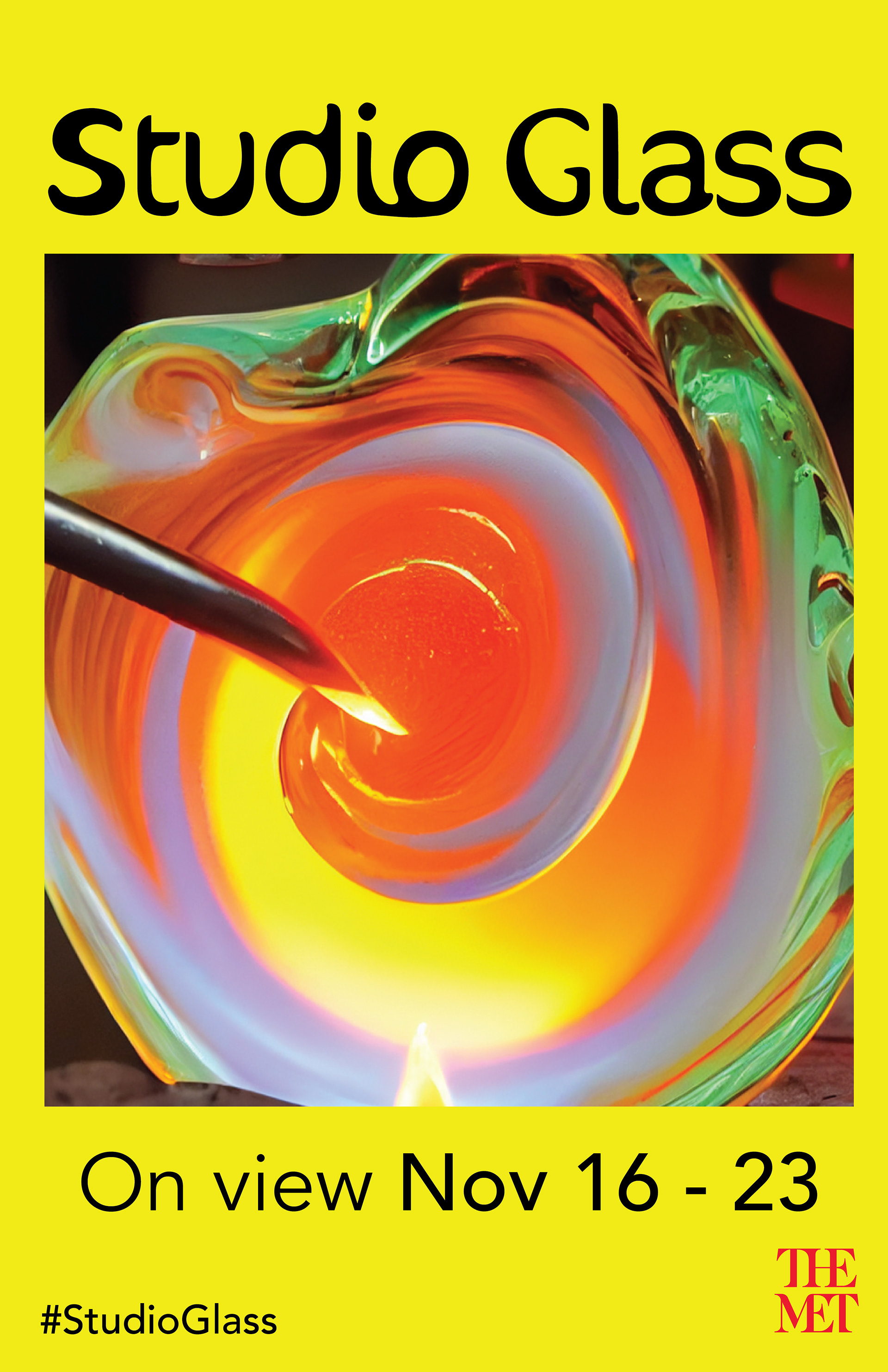
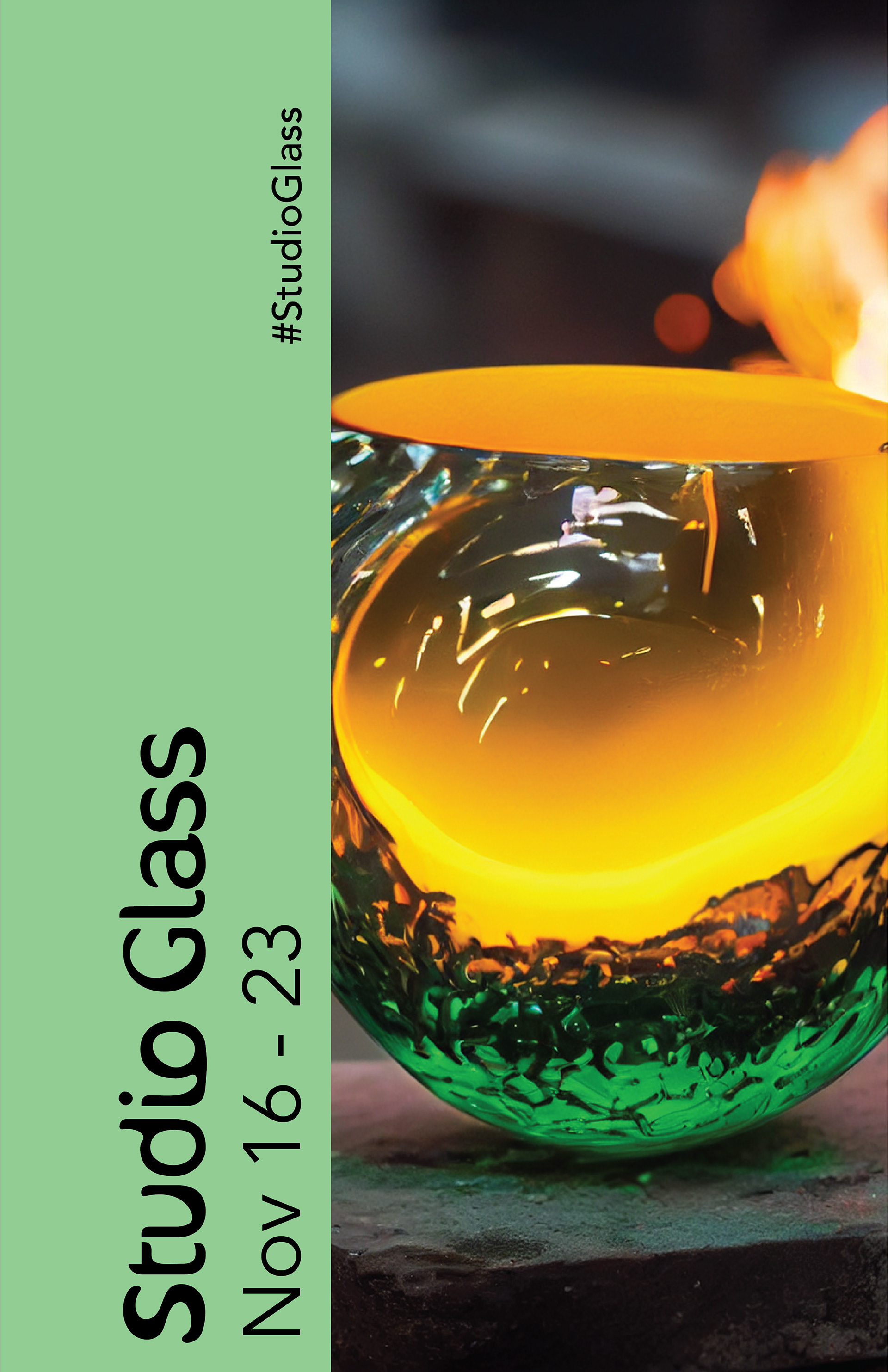
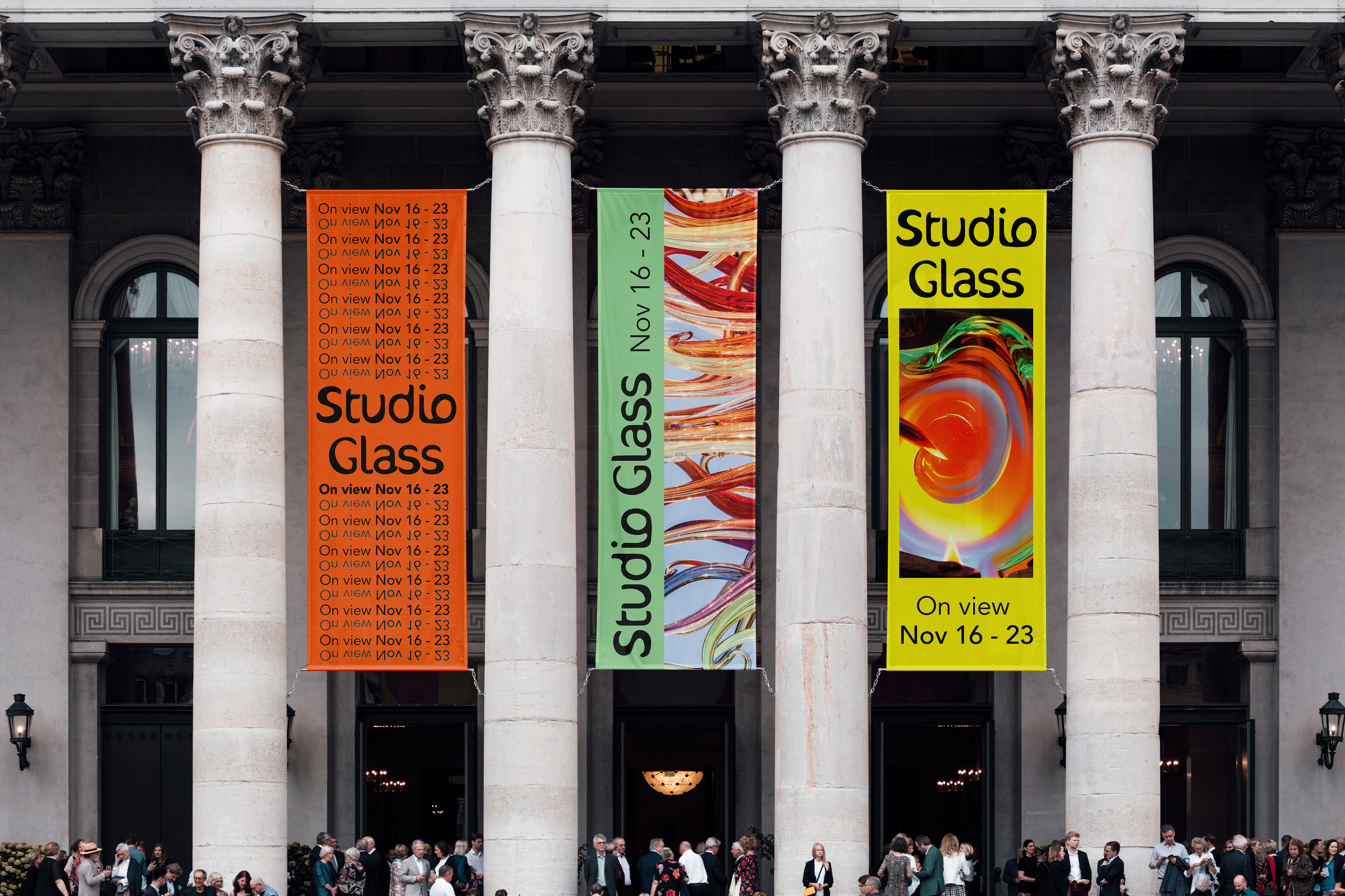
With the poster design, I focused on referencing the properties of glass through the repetition, reflection, and blur of the type as well as highlighting the works that could be in the exhibition through bold photographs that take up most of the page. I then translated the poster design into print ads and physical banners at multiple scales.
With the poster design, I focused on referencing the properties of glass through the repetition, reflection, and blur of the type as well as highlighting the works that could be in the exhibition through bold photographs that take up most of the page. I then translated the poster design into print ads and physical banners at multiple scales.


Social Media
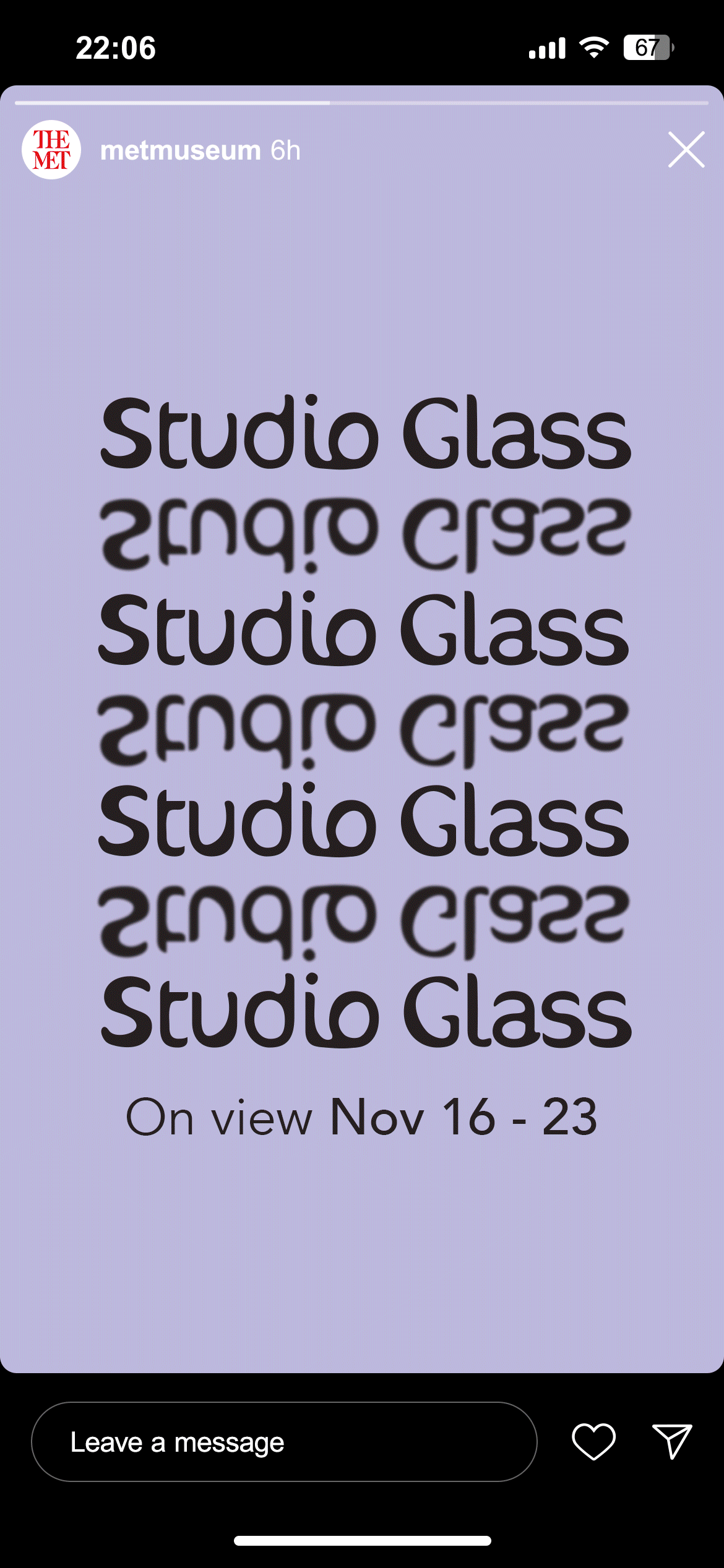
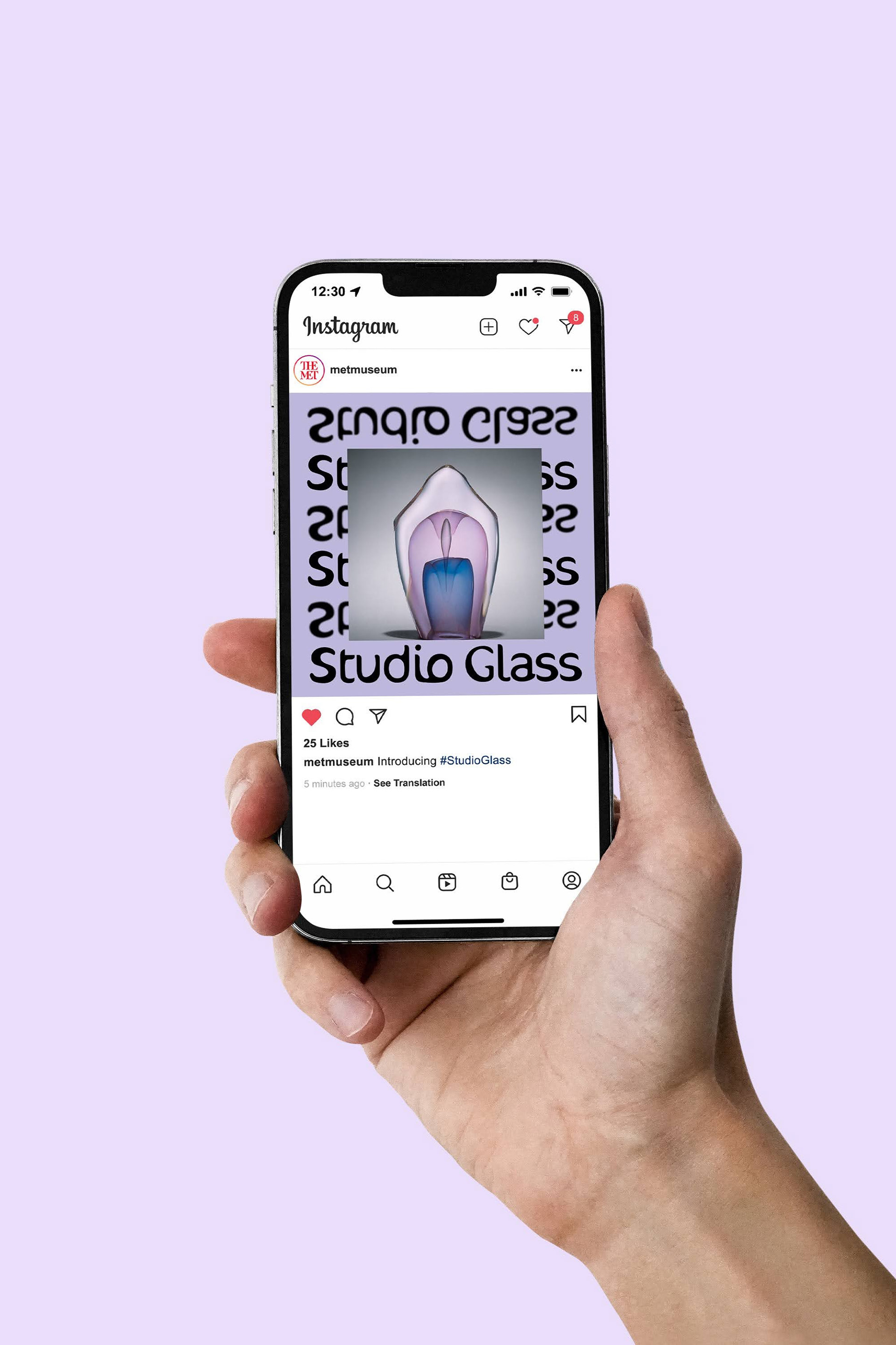
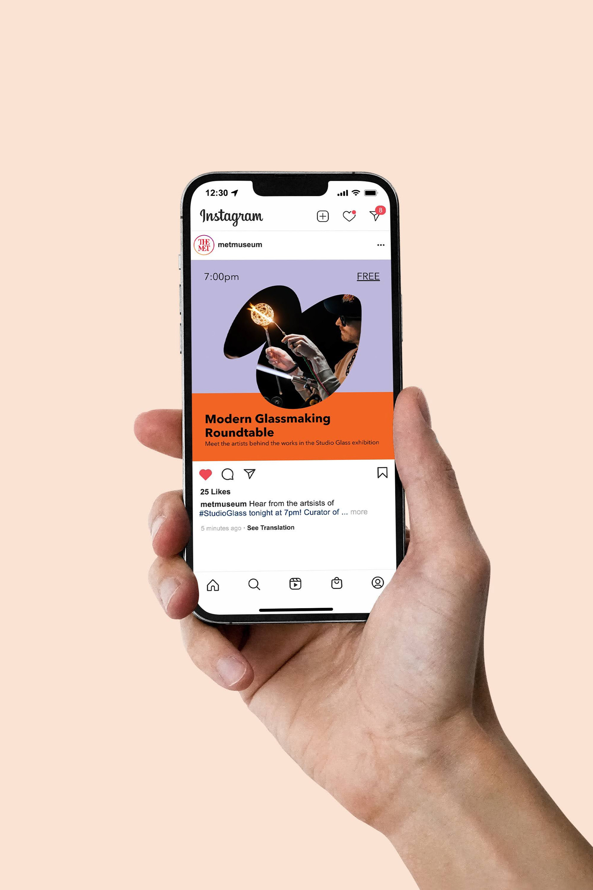
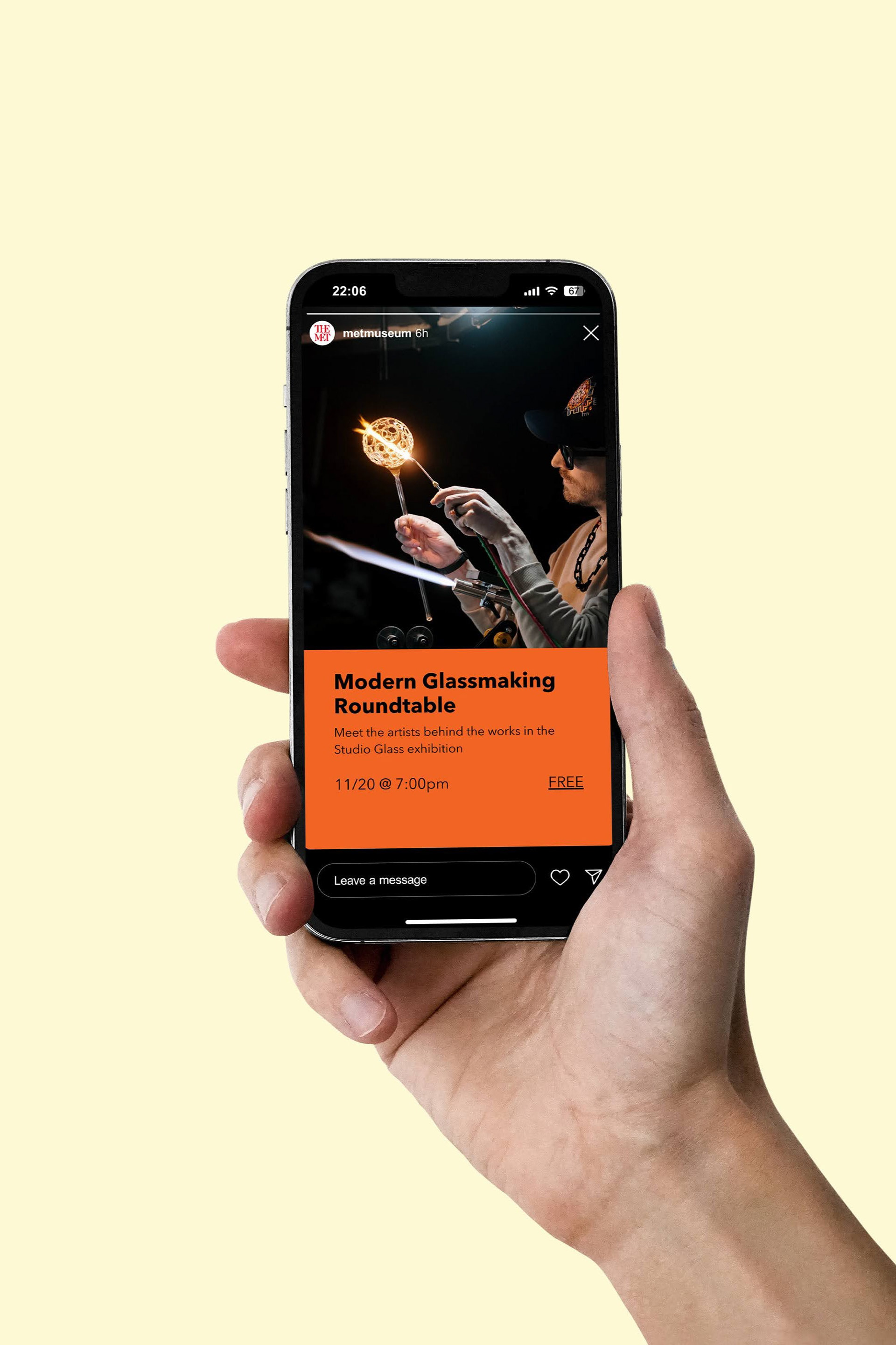
The last piece of the puzzle was designing Instagram posts and stories for Studio Glass. Continuing the visual direction of the poster design, I adapted the properties of the posters to the stories and posts announcing the exhibition. I also created an announcement for a fictional artist panel, keeping the design minimal to keep the focus on conveying information on the event.
The last piece of the puzzle was designing Instagram posts and stories for Studio Glass. Continuing the visual direction of the poster design, I adapted the properties of the posters to the stories and posts announcing the exhibition. I also created an announcement for a fictional artist panel, keeping the design minimal to keep the focus on conveying information on the event.