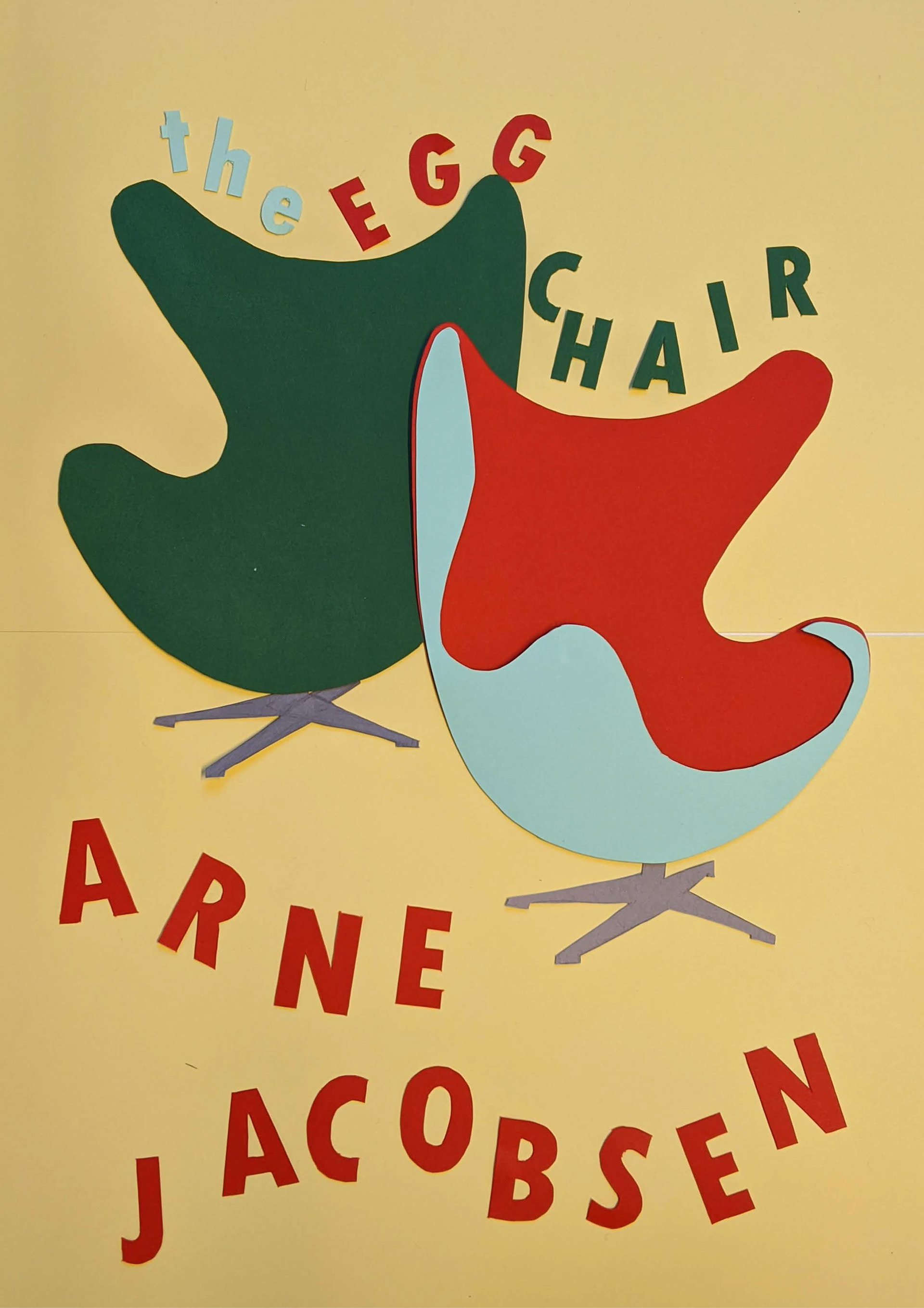
As a part of the first project for my Graphic Design Foundations course at the Danish Institute for Study Abroad (DIS), we were assigned to create three A3 posters with the design of famed Danish designer Arne Jacobsen, the Egg Chair, as the subject for the work.
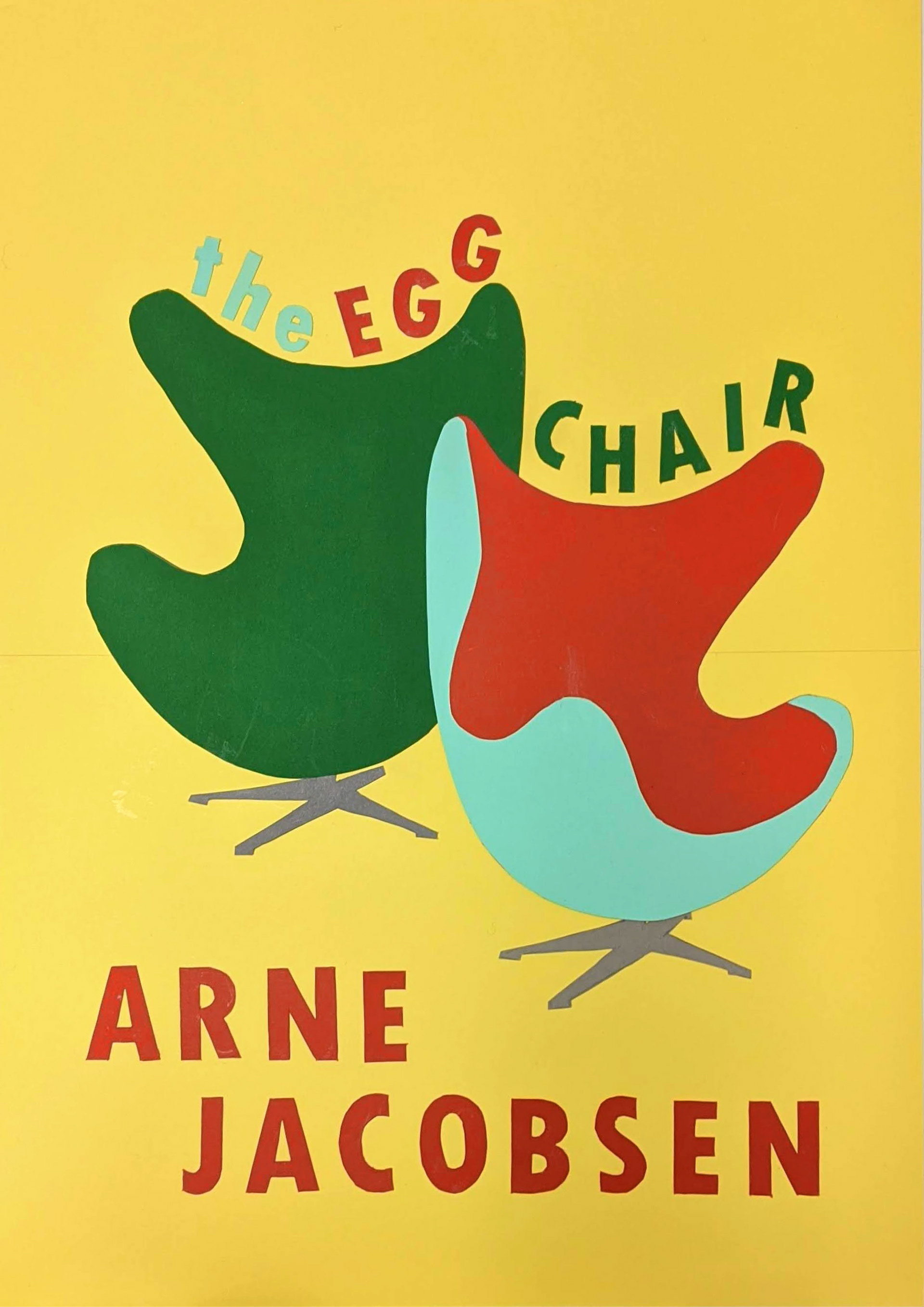
Several conditions were assigned to each poster. In poster 1, pictured on the left, the poster had to be entirely made by hand. In keeping with the 50's aesthetic of the time the chair was made, I chose a color palette familiar to the time period, yet different enough from current trends to stand out.
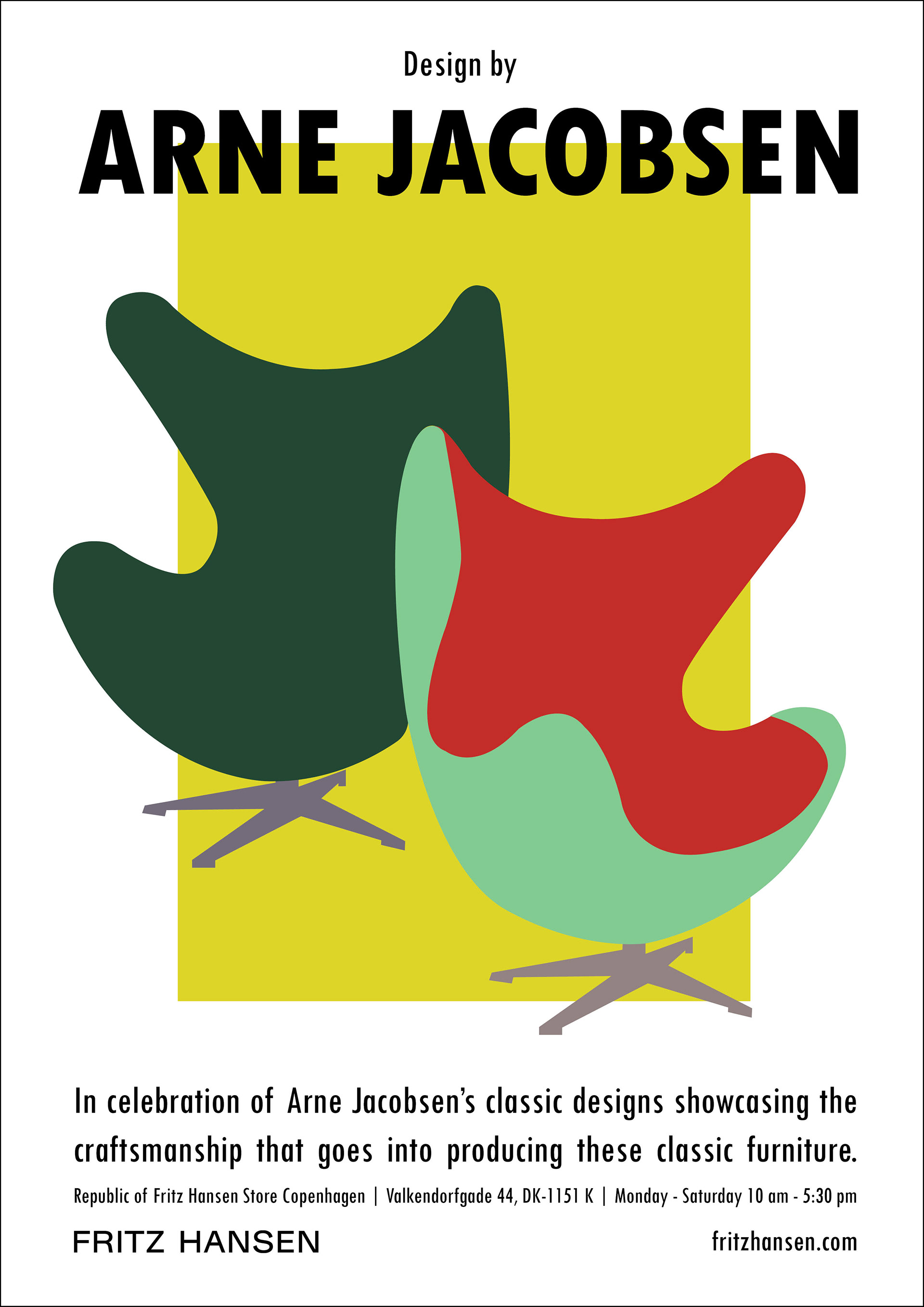
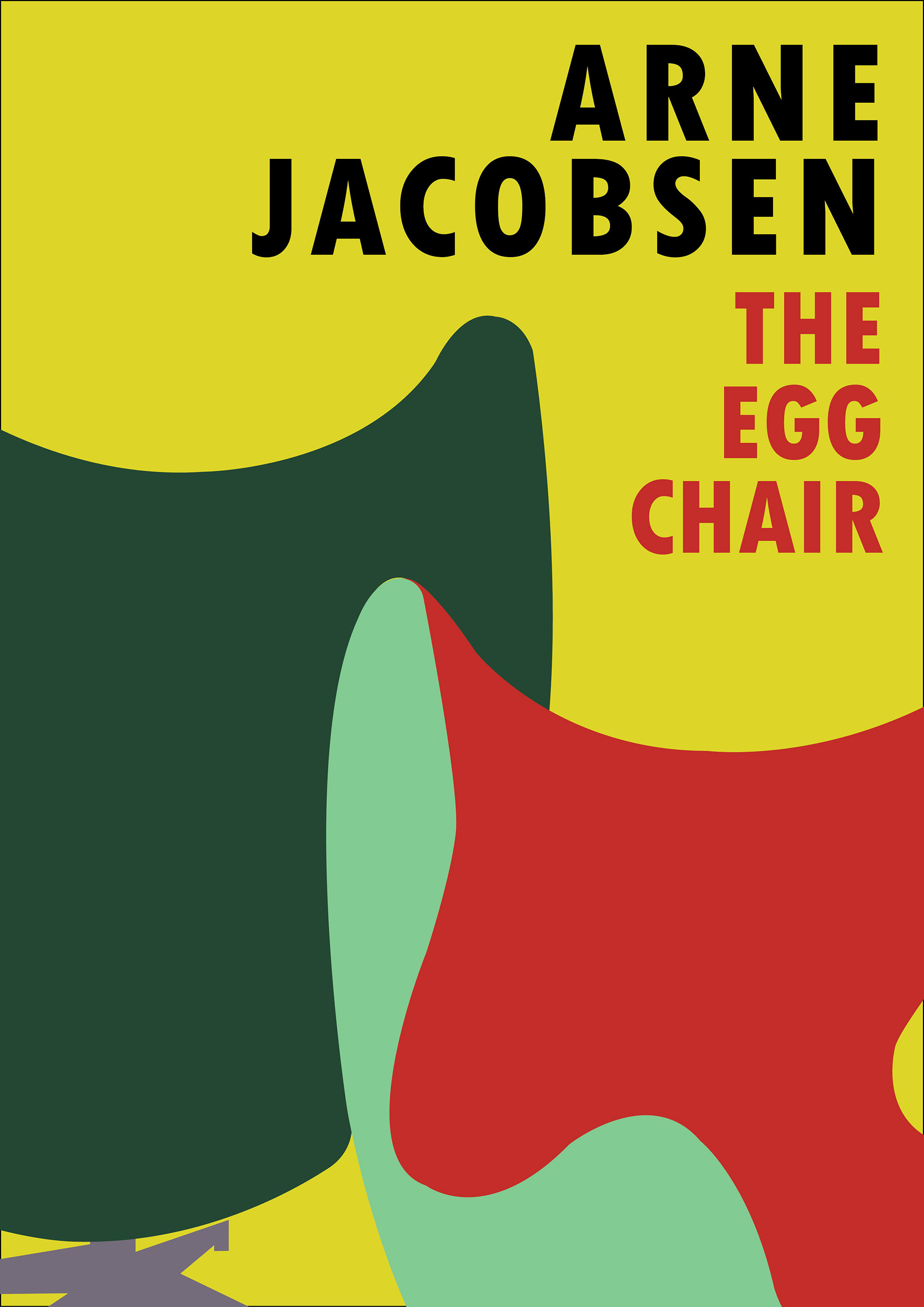
Poster 2 was made advertise the showing of Jacobsen's products at the Fritz Hansen store. I used strong linear elements to highlight the curvy, sculptural quality of the chair.
Several iterations of each poster was made as well. Pictured here are iterations of Poster 1, 2, and 3 respectively.
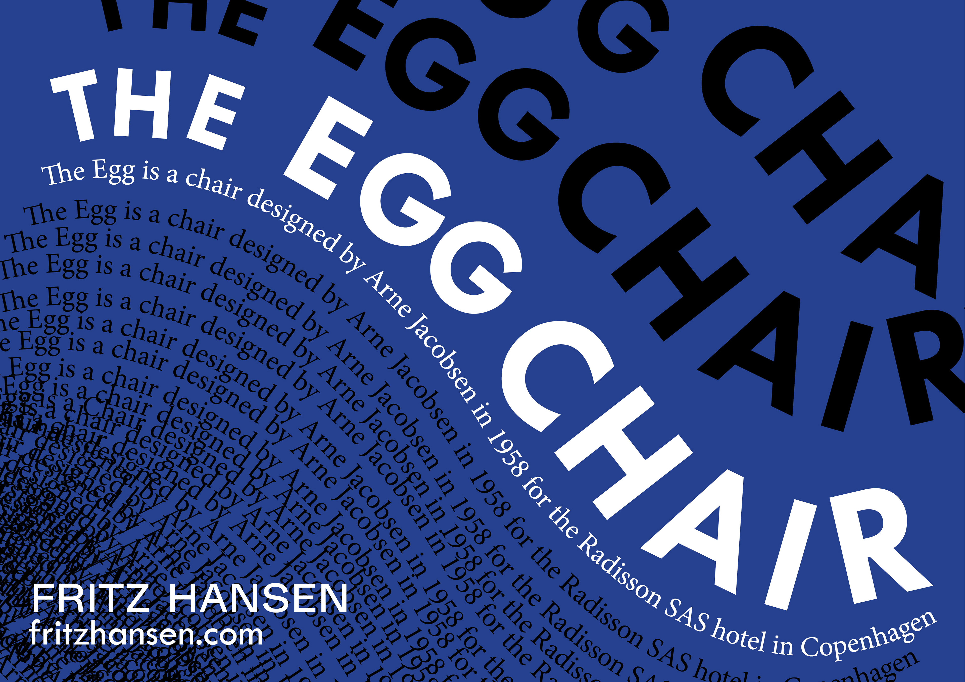
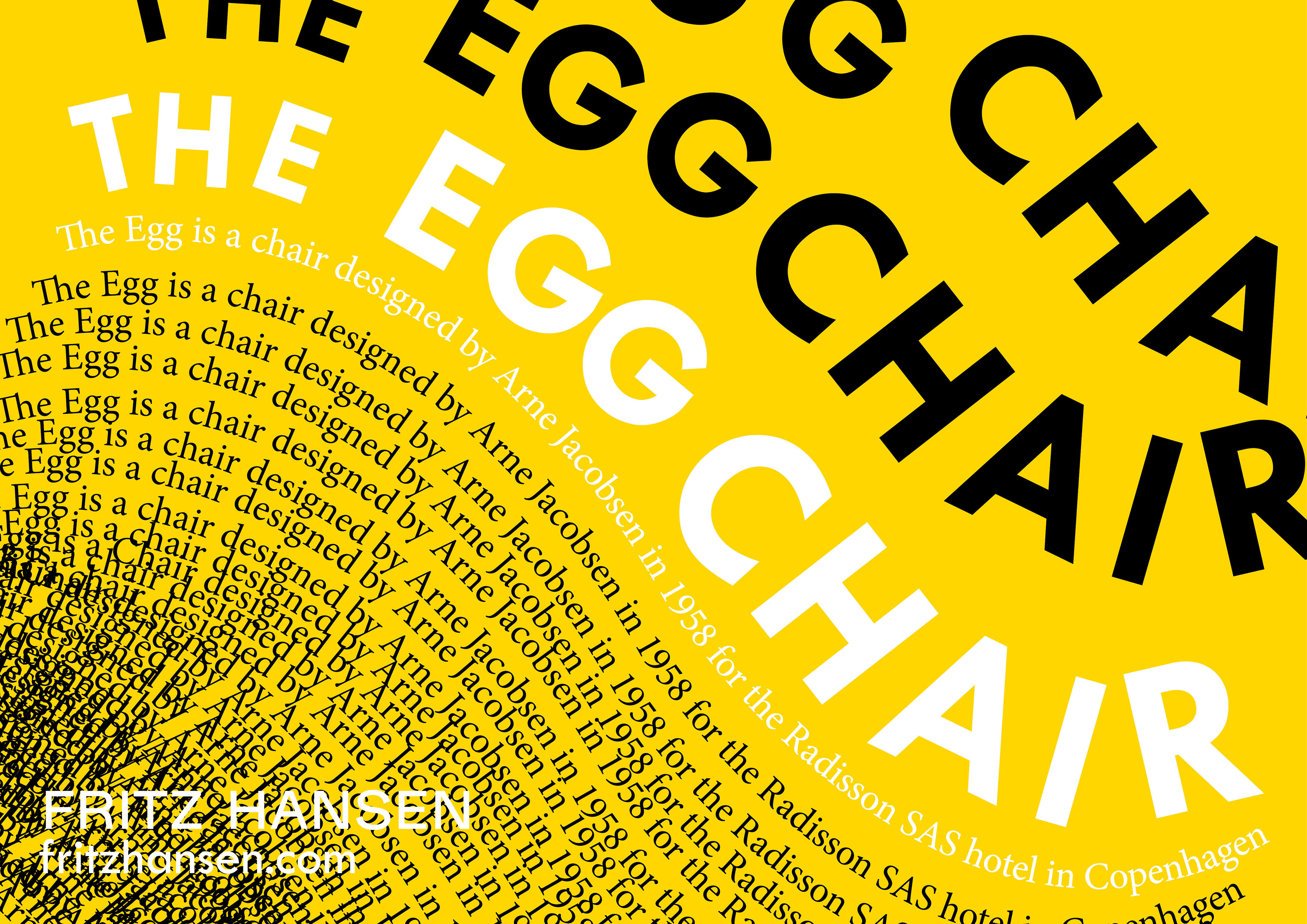
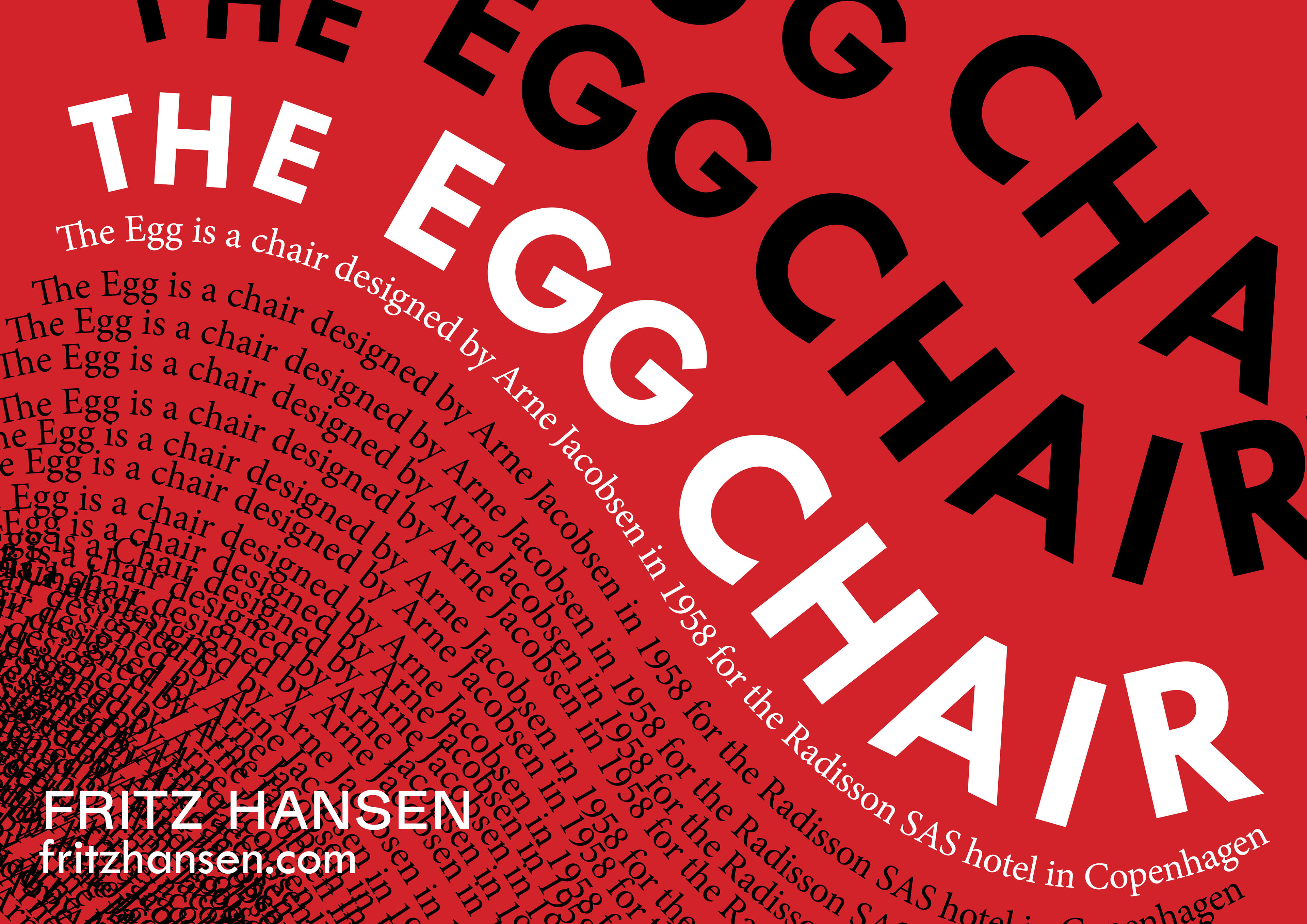
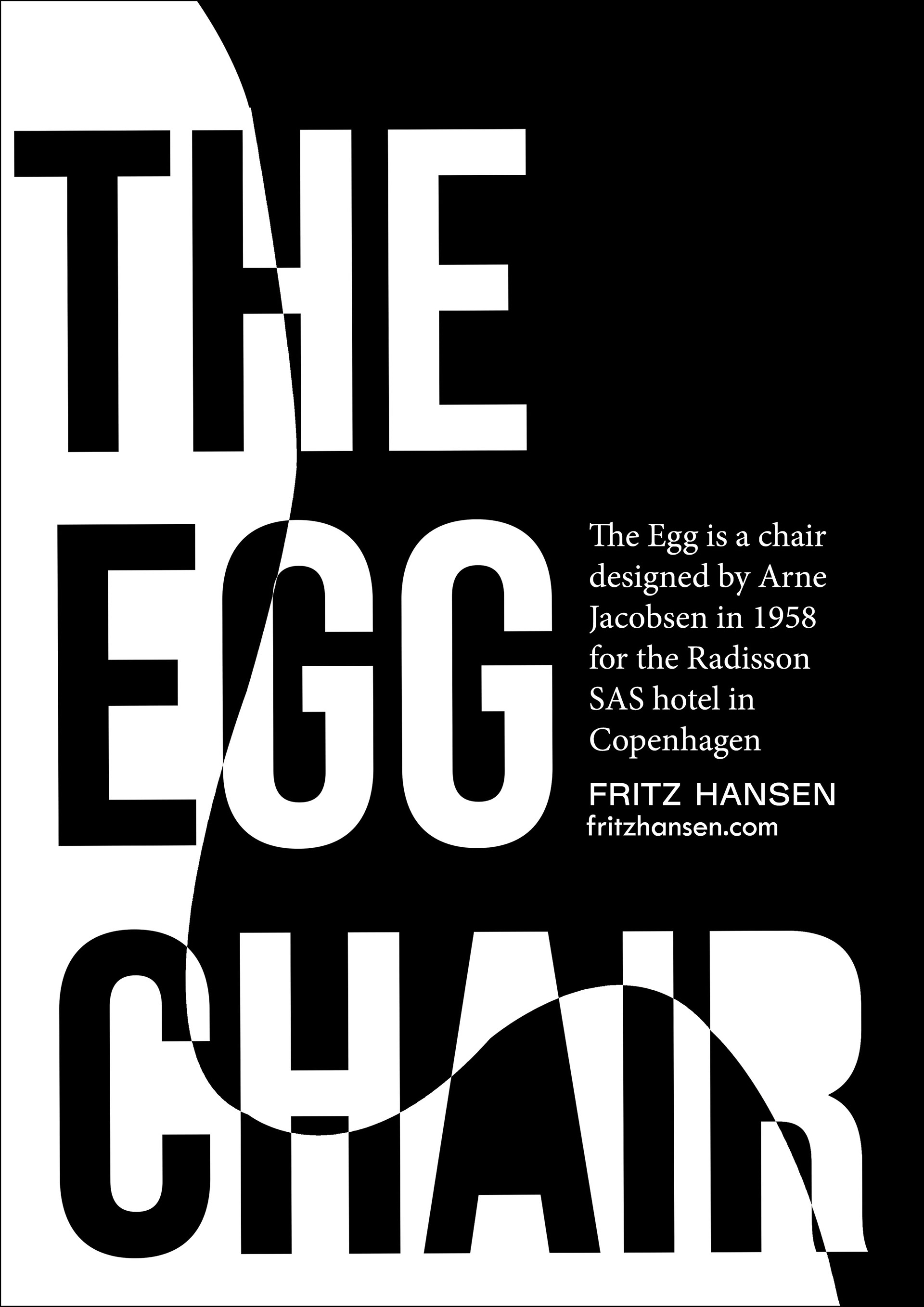
The brief for poster 3 required us to only use text in our design. I played with the type to mimic the curves of the chair. The repetition of the phrase "the egg is a chair..." creates a texture that makes the effect of a solid mass. Several color variations were also included, with the idea that they could be a set of the same poster.